
The Biggest Paint Colour Trends for 2020
Every year, paint brands and colour experts predict what they feel will be the most popular palettes for the year ahead.
Read on for a round up of the biggest paint colour trends for 2020.
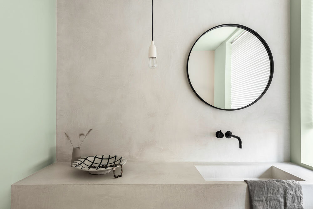
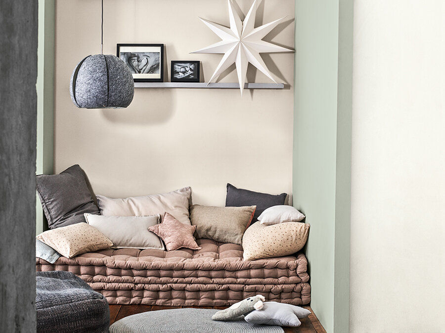
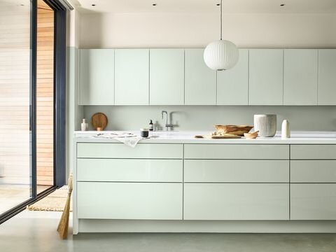
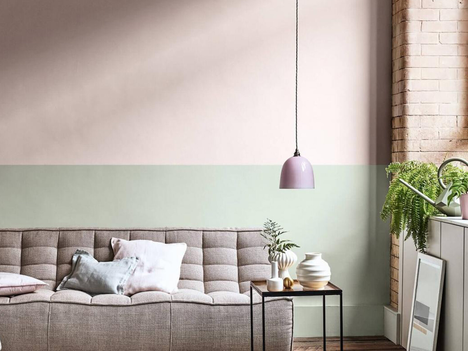
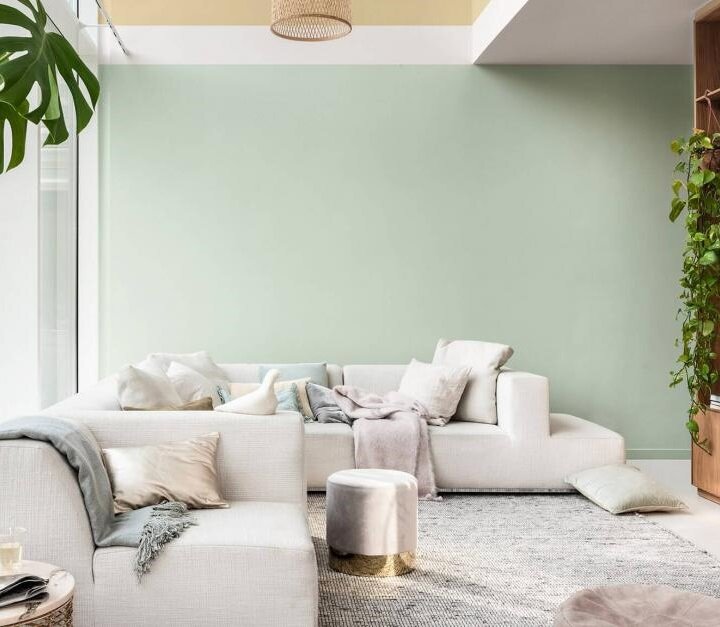
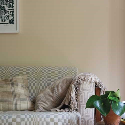
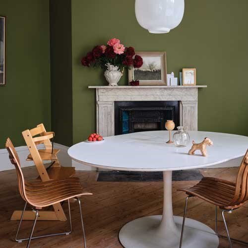
Dulux’s Tranquil Dawn
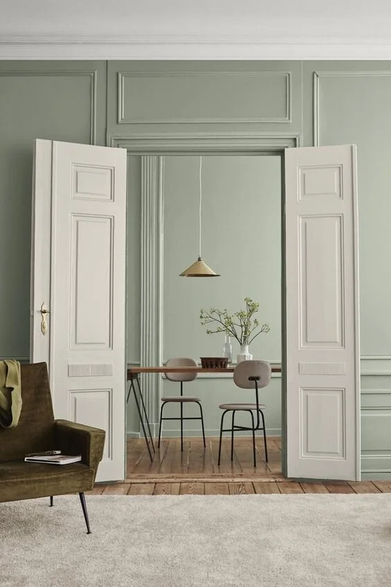
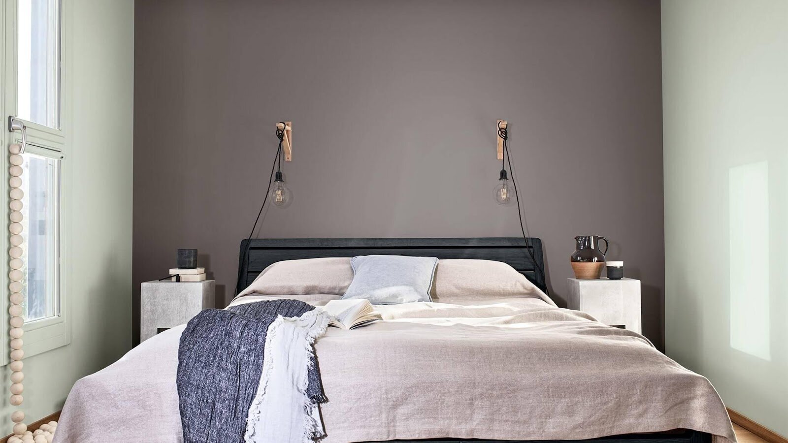
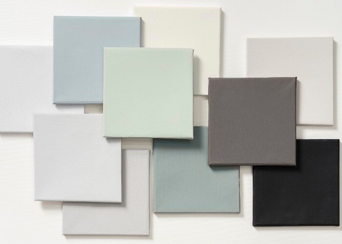
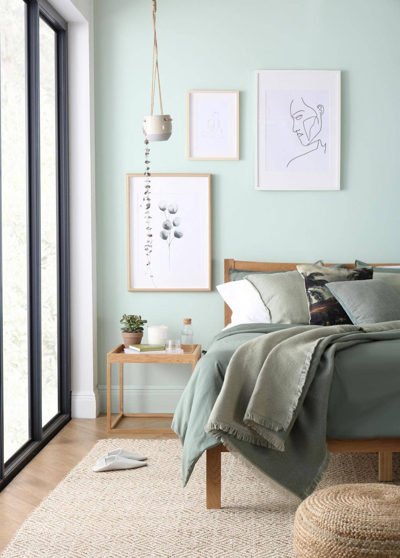
Earlier this year, global paint brand Dulux revealed that it had chosen Tranquil Dawn as its 2020 colour of the year.
“A colour inspired by the morning sky, to help give homes the human touch. This versatile shade of green can be used to create spaces for care or for play, to find meaning or for creativity.”
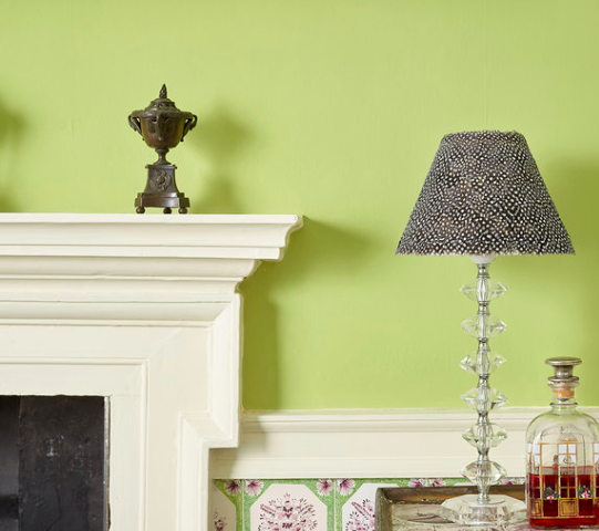
In its essence, Tranquil Dawn is an easy-going green / grey that lends itself well to all rooms in the home. From bedrooms and bathrooms to living rooms and kitchens, the pale neutral shade ticks a number of boxes, including our increasing need to incorporate a hint of nature, or at least nature-inspired tones, into our homes. If pastels are your thing, Tranquil Dawn pairs perfectly with dusty pinks and pale blues but if you are looking to achieve an effortlessly modern scheme, this soothing shade will work just as well when paired with contemporary accessories and industrial-inspired concrete-effect finishes.
All images sourced from dulux.co.uk

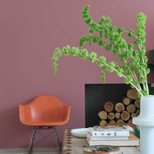
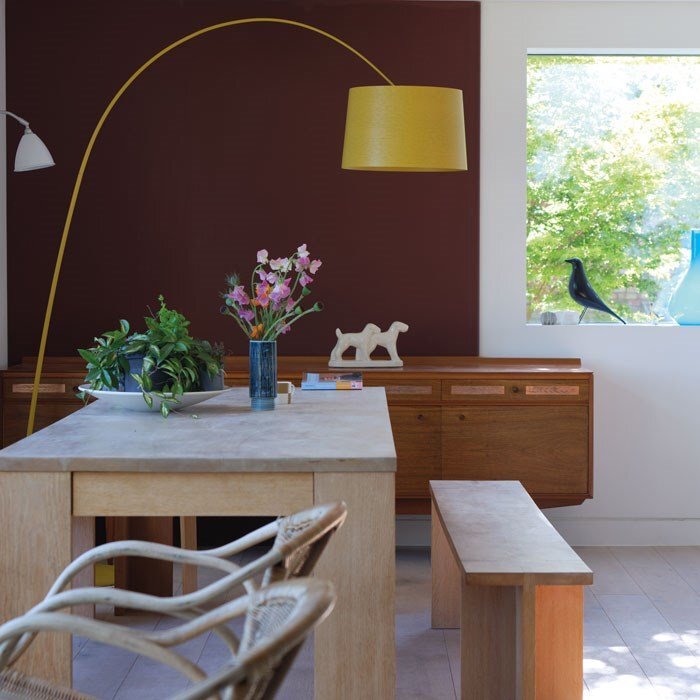
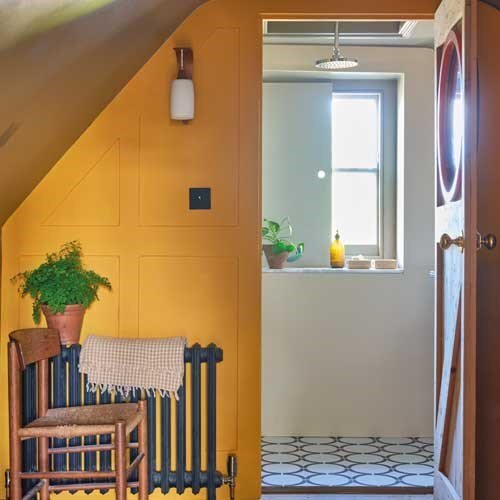
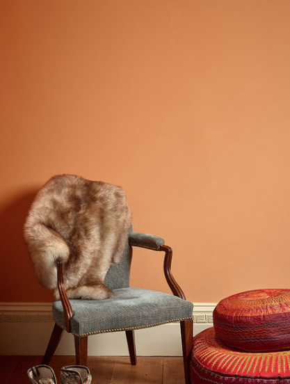
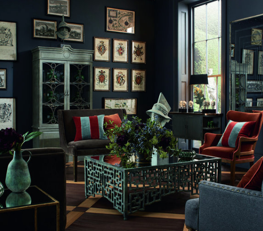
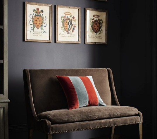
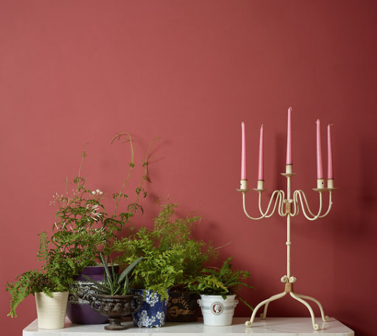
Farrow & Ball and The Natural History Museum
Working with the Natural History Museum, Farrow & Ball introduced a range of 16 colours into its offering. Inspired by shades found in one of the Museum’s rare archive library books, the Colour by Nature collection depicts shades and hues from the natural world. From the aptly named ‘Duck Green’ to the vibrant ‘Lake Red’, this new collection of colours hits the mark when it comes to variety. Complete with adaptable neutrals, a spectrum of greens, a range of blues and a selection of red-based shades, there’s something for everyone in this new paint collection.
All images sourced from farrow-ball.com
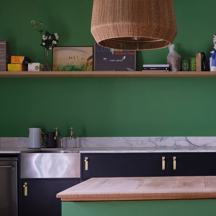

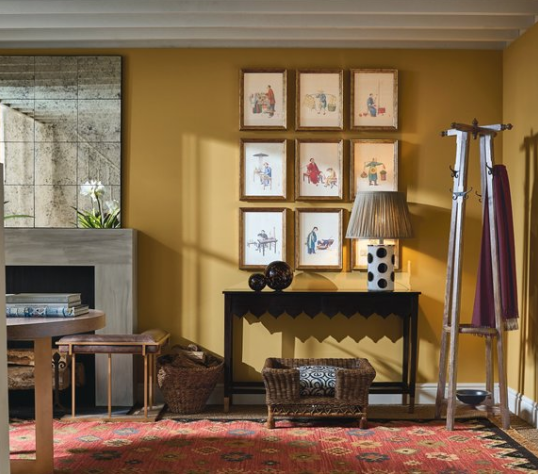
Crown Paints 2020 Colour Trend Predictions
Rather than sticking to a single shade, colour experts at Crown Paints have revealed their 2020 colour trend predictions in three separate ‘philosophies’. Filled with striking colour palettes and presented in unique and eye-catching imagery as always, here we take a look at the company’s latest predictions.
All images sourced from crownpaints.co.uk

Rethink
“New tones are revealed in this synthesised collection. The green and pink become allies in generating a powerful artificial environment that engages with the architecture to redefine its lines and angles. It creates the perfect backdrop for light refined furniture to sit as man-made sculptures in its footprint,” Neville Knott, Crown Colour Consultant.

Connect
“Drawing from nature, the colour palette is heavy in greens. Never boring, though – with shades ranging from soft mint, through earthy tones of khaki green and mustard yellow, and ending on a deep jade green of Botanical Noir for a statement wall,” Justyna Korczynska, Crown Design Studio.

DIRECT
“Differing weights of colour create dynamism and tension, whether connecting one room to another or adding a block of contrast across natural architectural boundaries.” Judy Smith, Crown Colour Consultant.

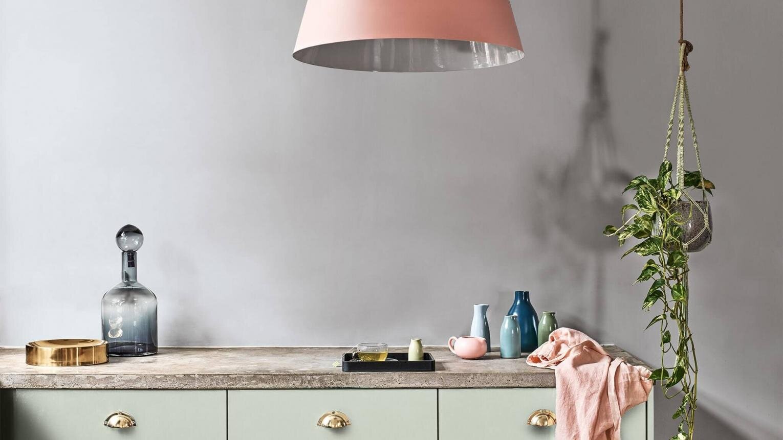
Mylands Paint Spring 2020 Colour Palette
A celebration of blue in all shades and tones, Mylands presents four contrasting hues, from bight and bold through to soft neutrals, for its spring 2020 colour palette. Made up of Walpole No.42, Morning Blue No.32, Observatory No.34 and FTT-018, this latest palette from Britain’s oldest family-run paint manufacturer perfectly depicts the beauty and versatility that can be found in blue, whether you’re looking to incorporate a neutral and calming feeling or making a bright and vibrant statement.
Image sourced from Mylands.com

Painting the future with plastic free paint from Edward Bulmer
An avid advocate of truly natural paint, Edward Bulmer has added 20 new colours to his broad and beautiful range of healthy paints. Created from only 12 earth and mineral pigments mixed with natural binders, the new colours are a gorgeous collection of versatile and relevant shades for 2020. From the deep shade of Tingry to the bold and vivid Pompadour and Dutch Orange, all tastes and styles are catered for in this now 90 strong palette of plastic free paints.
All images sourced from edwardbulmerpaint.co.uk
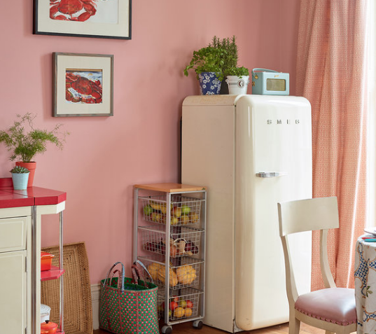

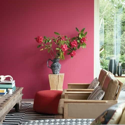
Benjamin Moore’s First Light
“The colour symbolises a new dawn of idealism, design and living and that it was chosen to reflect the air of positivity radiated by consumers entering a new decade.” Andrea Magno, Director of Colour Marketing at Benjamin Moore
Described as ‘the backdrop for a bright new decade’, Benjamin Moore’s 2020 Colour of the Year First Light 2102-70, is a soft, rosy hue that blooms with potential. Unveiled amongst a harmonious palette of ten colours, First Light combines effortlessly with complementary light tones such as pale greys, light blues and soft greens whilst also contrasting beautifully with deeper and bolder shades.
All images sourced from benjaminmoorepaint.co.uk

PANTONE’S CLASSIC BLUE
“Instilling calm, confidence, and connection, this enduring blue hue highlights our desire for a dependable and stable foundation on which to build as we cross the threshold into a new era.”
Restful, enduring and, of course, classic, Pantone’s 2020 Colour of the Year reflects our inherent yearning for a positive future. Arguably a comfortable and safe colour choice, there’s no denying that this timeless shade of blue instils both calm and confidence and we’re sure to see plenty of Classic Blue in our homes throughout 2020. Revealed alongside varying and versatile corresponding palettes, the Pantone Colour Institute positions Classic Blue as a peaceful and tranquil colour – a ‘universal favourite’ that can be incorporated into homes next to a broad range of shades, textures and styles. After the infiltration of Living Coral (Pantone’s 2019 Colour of the Year) into our homes, we’re looking forward to seeing how Classic Blue materialises in our lives and our interiors.

You May Also Like:


