
Tranquil Dawn: Dulux Colour Of The Year 2020

A calm, serene and timeless green, Tranquil Dawn has been selected as the must-have colour of 2020. Global paint brand, Dulux unveiled its eagerly anticipated colour of the year this month saying it represents the ‘morning sky, to help give homes the human touch.’ Selected by an expert panel of colour designers, trend forecasters, design specialists and architects, it is said that the colour symbolises a need to create an interior that is safe and relaxed and a place where people can unwind and separate themselves from the chaos that goes on around us. We are definitely a fan of this gentle shade as it works effortlessly as a soft neutral background to deeper tones, bringing an earthy and natural aesthetic to the modern home.

Alongside the chosen colour of the year, four accompanying palettes are also revealed. Next to Tranquil Dawn, Dulux has highlighted a whole range of complementary colours to help you create a cohesive finished look. Let’s take a closer look at the 2020 colour palettes:

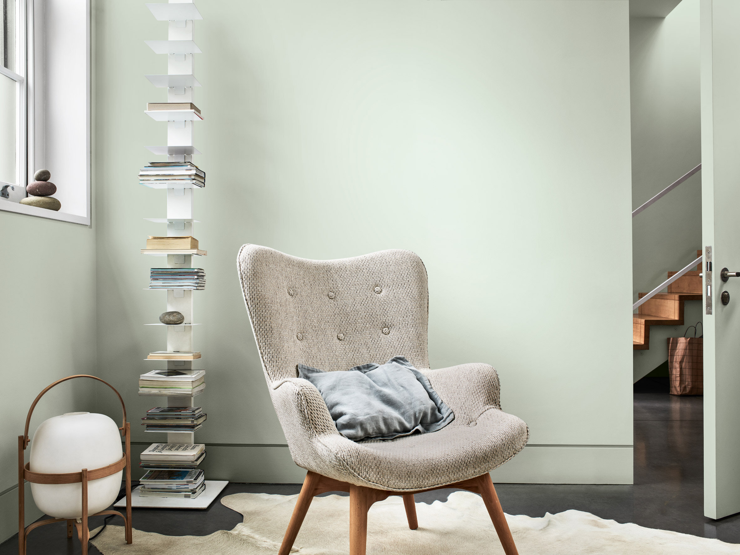
A Home for Care
A soft and airy palette, to create an interior that enhances a relaxing and tranquil feel.

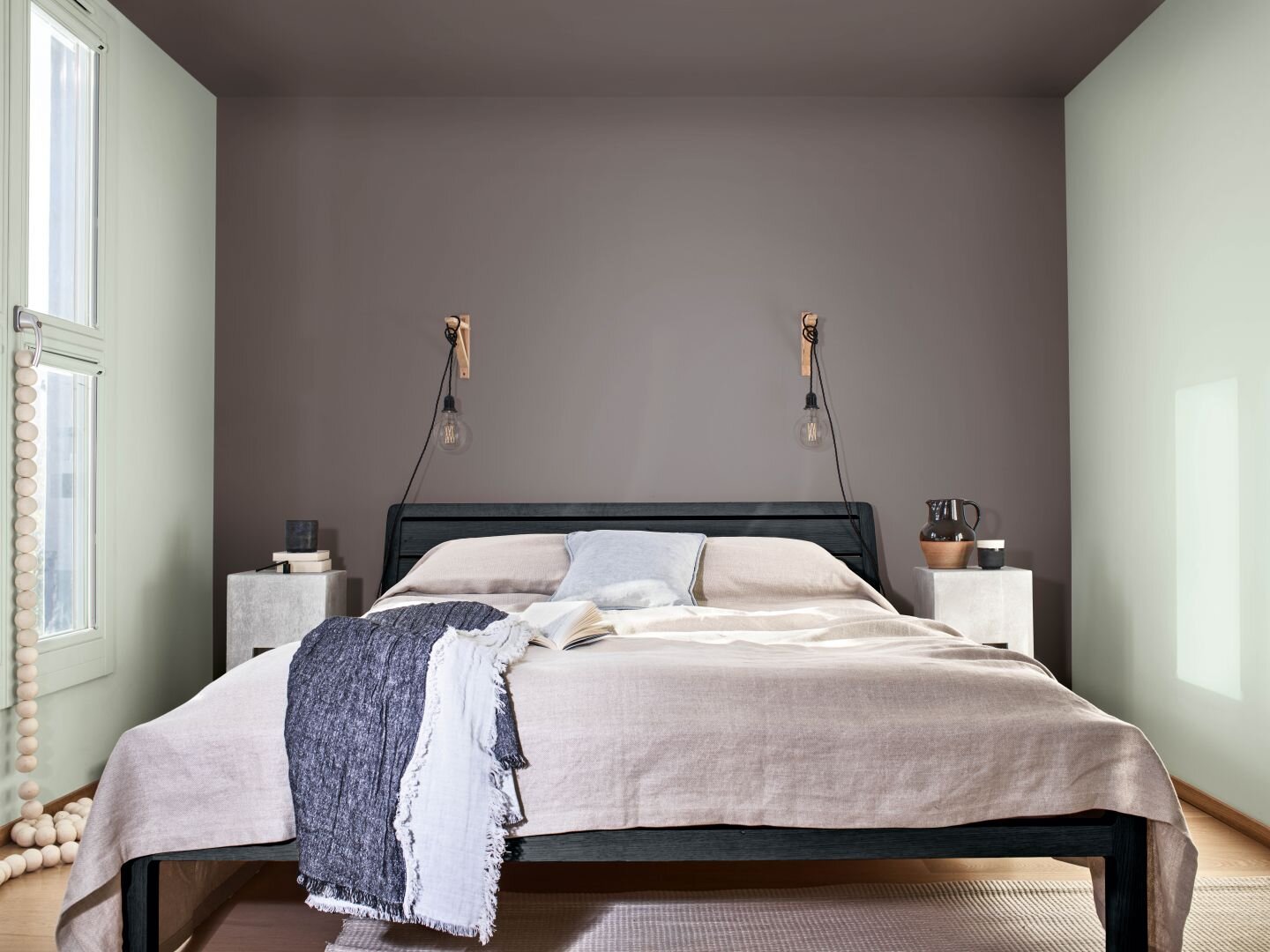
A Home for Creativity
Rich and intense, a palette that creates a moody and eclectic feel to all interiors.

A Home for Play
Bold and vibrant, this palette showcases statement colours with delicate hues to create a sense of energy and liveliness.

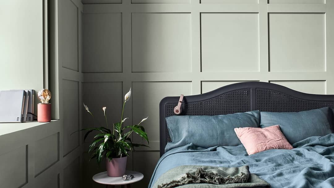
A Home for Meaning
Minimalist greys make up this soothing palette to create a space for calm and contemplation.


